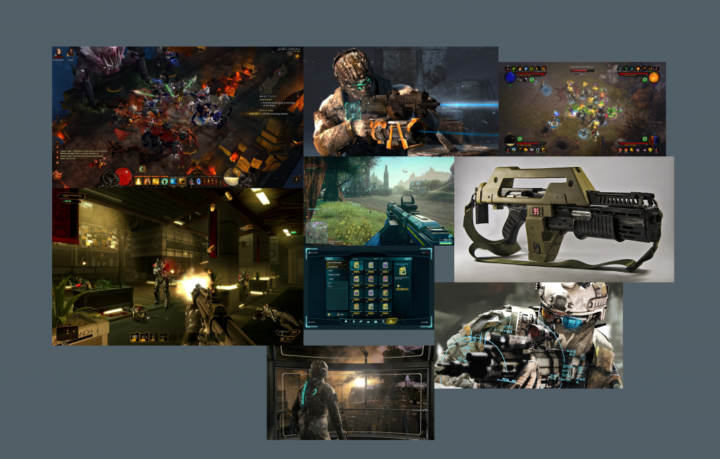
This was the mood board of a small selection of games that we wanted to merely take their artistic direction from and adapt our own.
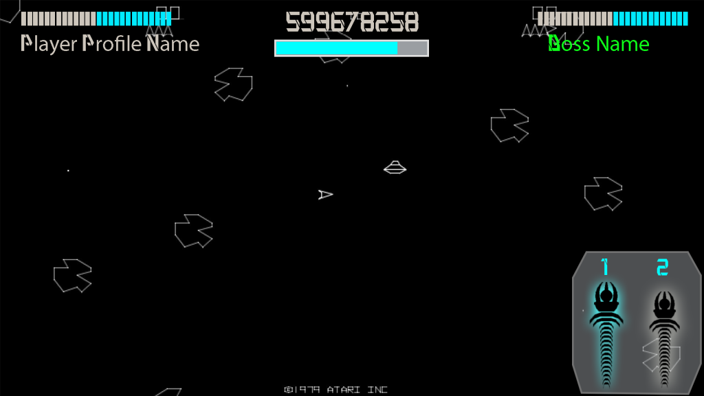
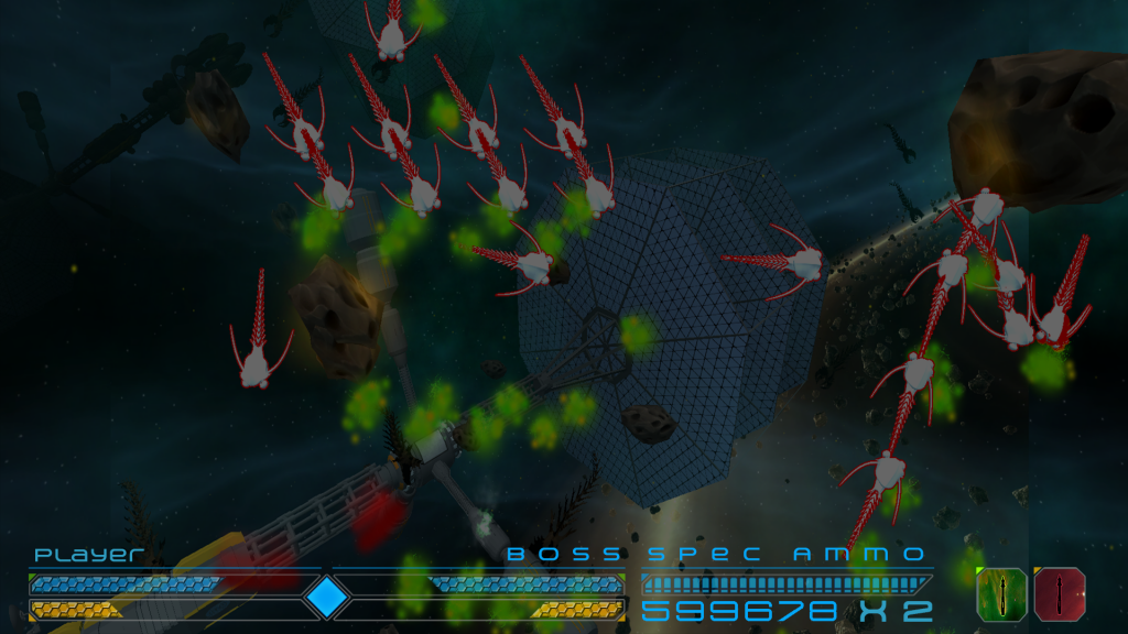
The ingame UI or the HUD if you will rarely had artistic cohesion with the menu’s where the main focus of the development and art style took place. So the first one was a bit bare as expected, most of this is based on the preliminary layout.
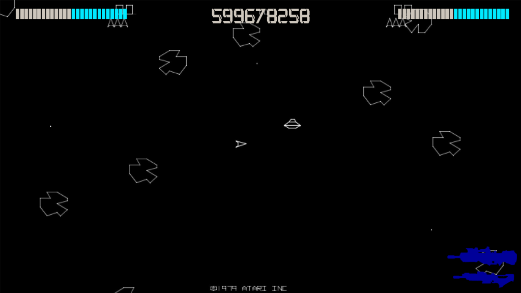
As initialy we wanted to keep a minimalist art style so we decided to remove a lot of visual information and minimalize it. As seen below.
Then to make it even more simplified:
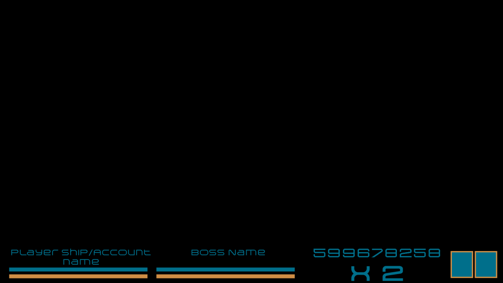
After many iterations of the menu’s art style we came back to the ingame UI and decided on a whole new art style that fit with the game instead of the artistic vision, it was more of a derived from both.
And to clean it up with some touch ups and new ideas with input from the team leads:
The Menu’s:
As mentioned before the menus were given the most attention and focus and were probably changed more often.
There were many changes especially concerning the layout at the beginning of the development process.
The screen that went through the most iteration’s was the ship customization screen, or the shop window as it went by in early development.
In between we did have concepts for screens such as the high score but the high score screen was soon removed from development. Ship customization look and feels exactly the same. I would also like to note that this ui was done in quick succession with lots of iterations to quickly have a working UI. The design was finished however very little of it ended up in the early builds.
As the first version of the UI was for the first block the second block gave us more time and feedback so we could adjust and change the UI as we saw fit. Large changes were made especiallyon the color pallet.
The above ship customization is the finalized version for the v2 of the menu’s but before that I went all out on the design and the above picture of ship selection shows the design I had, but in the end we remained with our minimalism theme and I tore most of this screen down to produce the below picture.
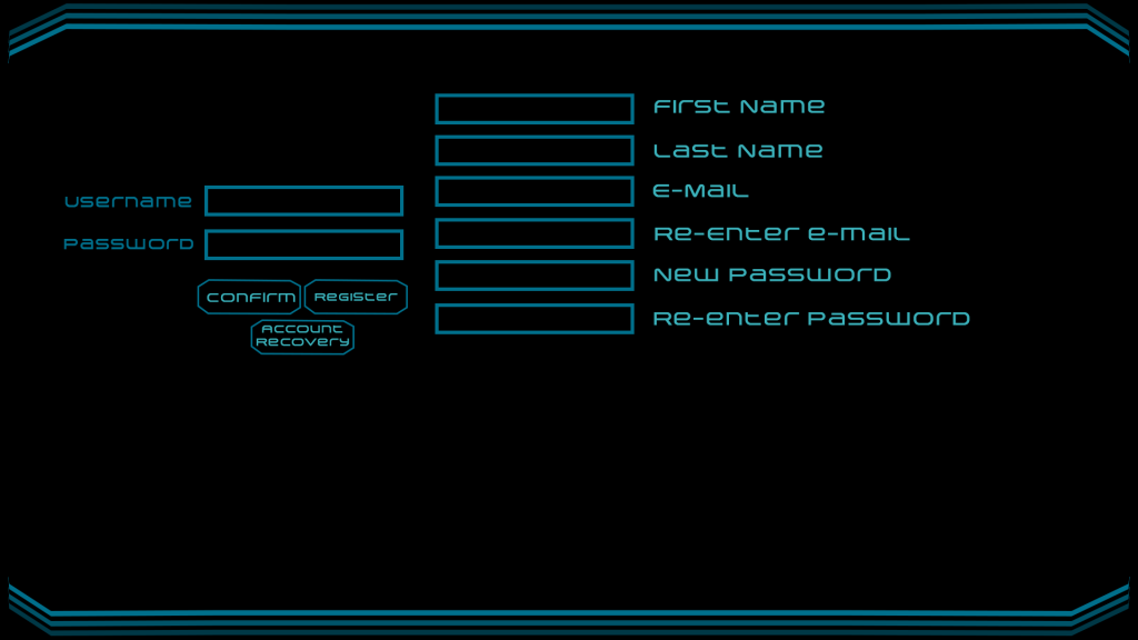
What did become necessary at this point in the development of the game was that we needed a login screen.
In week 12 Oliver Engels came with the suggestion of a new art style. I did have the chance to play around with it to see if I can make it more interesting. For a change the focus was this time on the in game UI or HUD if you will, at least from the perspective of the art style. We dumped the whole ship selection screen for a live in the background ship selection. The ship customization and login screen however are the only screens that survived fairly intact with minor layout changes.


